ShopDreamUp AI ArtDreamUp

Deviation Actions


Suggested Deviants


![[Re-make] HD Me](https://images-wixmp-ed30a86b8c4ca887773594c2.wixmp.com/f/6d985c5e-31cf-45d3-97f4-4410846c9d82/damx26k-a310fb4e-d291-4a72-be32-c1683a45b65d.jpg/v1/crop/w_92,h_92,x_6,y_0,scl_0.1486268174475,q_70,strp/_re_make__hd_me_by_blaye_art_damx26k-92s.jpg?token=eyJ0eXAiOiJKV1QiLCJhbGciOiJIUzI1NiJ9.eyJzdWIiOiJ1cm46YXBwOjdlMGQxODg5ODIyNjQzNzNhNWYwZDQxNWVhMGQyNmUwIiwiaXNzIjoidXJuOmFwcDo3ZTBkMTg4OTgyMjY0MzczYTVmMGQ0MTVlYTBkMjZlMCIsIm9iaiI6W1t7ImhlaWdodCI6Ijw9NjE5IiwicGF0aCI6IlwvZlwvNmQ5ODVjNWUtMzFjZi00NWQzLTk3ZjQtNDQxMDg0NmM5ZDgyXC9kYW14MjZrLWEzMTBmYjRlLWQyOTEtNGE3Mi1iZTMyLWMxNjgzYTQ1YjY1ZC5qcGciLCJ3aWR0aCI6Ijw9Nzg0In1dXSwiYXVkIjpbInVybjpzZXJ2aWNlOmltYWdlLm9wZXJhdGlvbnMiXX0.G_pt13Z5ltJnxPNGrn2UAsjPyPW1eMWC-MynaZbDALo)
Suggested Collections


![Kagami [Redraw]](https://images-wixmp-ed30a86b8c4ca887773594c2.wixmp.com/f/1818d90d-b224-46f8-9832-955b50c6cf4f/d9sbnmu-0a4a96bf-13ef-4b0b-b93c-70f0b0bcde79.jpg/v1/crop/w_184,h_184,x_25,y_0,scl_0.184,q_70,strp/kagami__redraw__by_serafleur_d9sbnmu-92s-2x.jpg?token=eyJ0eXAiOiJKV1QiLCJhbGciOiJIUzI1NiJ9.eyJzdWIiOiJ1cm46YXBwOjdlMGQxODg5ODIyNjQzNzNhNWYwZDQxNWVhMGQyNmUwIiwiaXNzIjoidXJuOmFwcDo3ZTBkMTg4OTgyMjY0MzczYTVmMGQ0MTVlYTBkMjZlMCIsIm9iaiI6W1t7ImhlaWdodCI6Ijw9MTAwMCIsInBhdGgiOiJcL2ZcLzE4MThkOTBkLWIyMjQtNDZmOC05ODMyLTk1NWI1MGM2Y2Y0ZlwvZDlzYm5tdS0wYTRhOTZiZi0xM2VmLTRiMGItYjkzYy03MGYwYjBiY2RlNzkuanBnIiwid2lkdGgiOiI8PTE1NDYifV1dLCJhdWQiOlsidXJuOnNlcnZpY2U6aW1hZ2Uub3BlcmF0aW9ucyJdfQ.x575aft9HIBfYWENhwPvWfg5bnlsof4nQLVRQWGuM-w)
![Kagami [Redraw]](https://images-wixmp-ed30a86b8c4ca887773594c2.wixmp.com/f/1818d90d-b224-46f8-9832-955b50c6cf4f/d9sbnmu-0a4a96bf-13ef-4b0b-b93c-70f0b0bcde79.jpg/v1/crop/w_92,h_92,x_13,y_0,scl_0.092,q_70,strp/kagami__redraw__by_serafleur_d9sbnmu-92s.jpg?token=eyJ0eXAiOiJKV1QiLCJhbGciOiJIUzI1NiJ9.eyJzdWIiOiJ1cm46YXBwOjdlMGQxODg5ODIyNjQzNzNhNWYwZDQxNWVhMGQyNmUwIiwiaXNzIjoidXJuOmFwcDo3ZTBkMTg4OTgyMjY0MzczYTVmMGQ0MTVlYTBkMjZlMCIsIm9iaiI6W1t7ImhlaWdodCI6Ijw9MTAwMCIsInBhdGgiOiJcL2ZcLzE4MThkOTBkLWIyMjQtNDZmOC05ODMyLTk1NWI1MGM2Y2Y0ZlwvZDlzYm5tdS0wYTRhOTZiZi0xM2VmLTRiMGItYjkzYy03MGYwYjBiY2RlNzkuanBnIiwid2lkdGgiOiI8PTE1NDYifV1dLCJhdWQiOlsidXJuOnNlcnZpY2U6aW1hZ2Uub3BlcmF0aW9ucyJdfQ.x575aft9HIBfYWENhwPvWfg5bnlsof4nQLVRQWGuM-w)


You Might Like…


Featured in Groups


Description
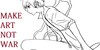
for ANYONE wondering: The two older drawings are from my OLD account [link]
Just wanted to mention that, so no one freaks out about it...
Anyways, there's roughly a year and some months difference between the second and the third piece... And I actually have to admit that looking back, I don't like the second one at all, I mean, yea the first one looks a little weird in some aspects (the anatomy of the face, especially the nose.. ugh.. or the hair or those spots of blood I tried to add) but it is just way more expressive than the second one, which looks just.... wrong (the hair looks still awful, don't get me started on the nose and moreover, it' s just expressionless..)
All in all, I like the newest one... I'm glad I made such progress when it comes to drawing technically and also delivering emotions and I'm also glad I used a traditional medium (namely acrylics) for it, because I'm just way better at painting traditionally.... I have also stopped drawing digitally, but maybe I'll start practicing it again soon.... or maybe not... I dunno...
Image size
1485x744px 1.14 MB
© 2013 - 2024 OneLonesomeArtist
Comments8
Join the community to add your comment. Already a deviant? Log In
I agree that the middle wasn't as good as the first. BUT, as they say.
Sometimes you have to take a step back to make a leap forward.
What you lost in the middle piece was that raw emotion. You found it again in the third, and pulled it through out the entire face, whereas you had to obscure part in the original to help get it across. There is, if anything MORE emotion in the newest piece. Her eyes speak volumes, and I love the defiant set to her mouth. She doesn't look so much like someone who has given up (as in the old one) as someone who has decided to use their pain to fuel her rage and push her on.
This tells a MUCH more vibrant story. Lovely.